Featured Project
Atlas.
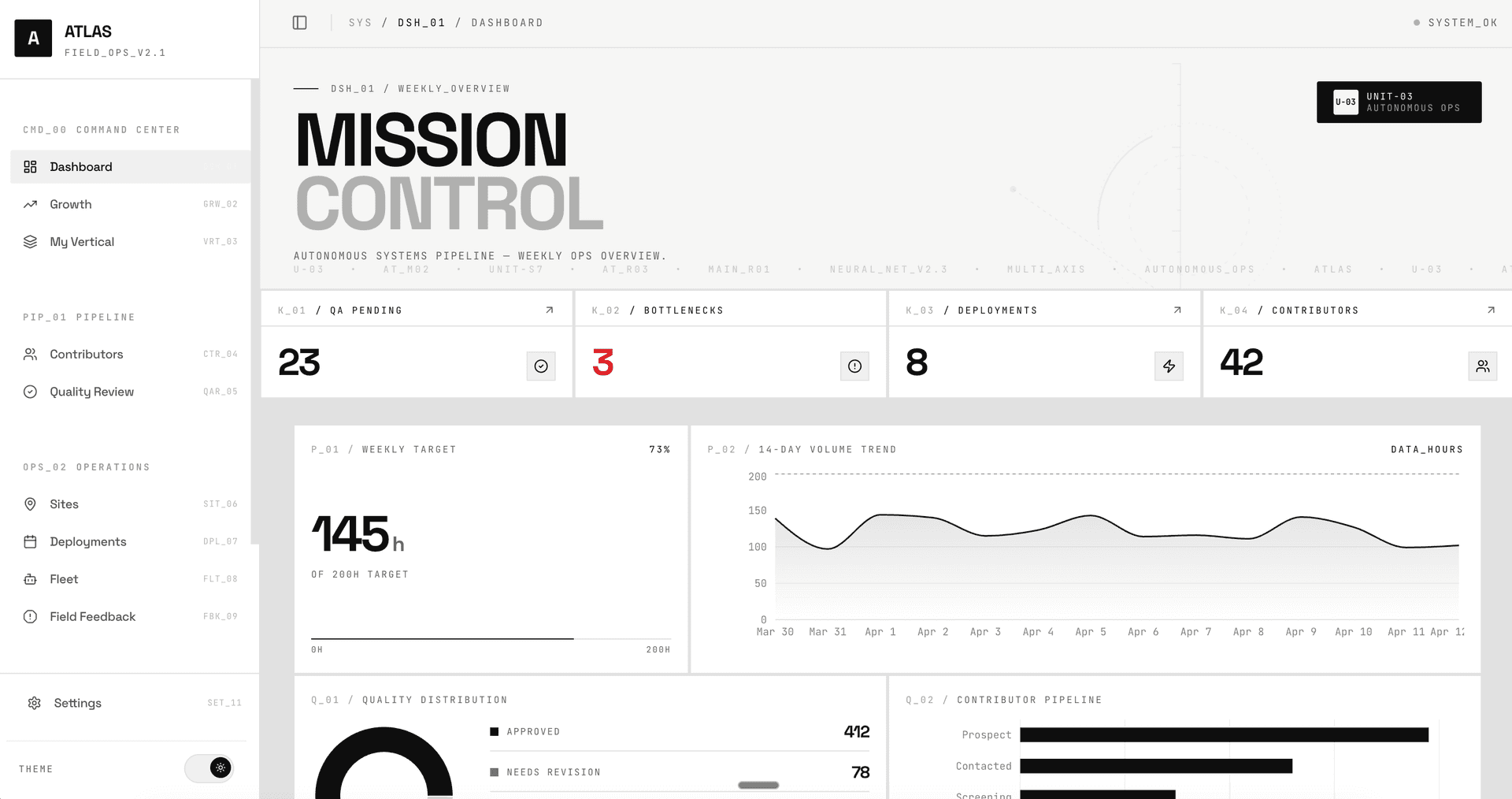
Mission control for robotics field operations. A prototype I built to explore what coordinating humans, robots, and autonomous systems in the field might actually look like.
Status
Deployed prototype
Timeline
1 weekend
Scope
12 pages, full lifecycle
Stack
React, TypeScript, Vite, Tailwind, Recharts
Built with
Claude + Playwright (Spot 🐕)
The why
Nobody was showing that part.
I've been following the robotics space for a while, watching companies go from demos to actual deployments. And I kept thinking: with all these robots out in the field, what does the control center actually look like? How does data collection flow? How does QA catch issues before they compound? How do field errors escalate back to engineering?
Nobody was showing that part. So I decided to build it.
What's in it
The main pieces.
- Pipeline — contributor acquisition funnel, kanban pipeline, onboarding stages
- Growth — cohort retention heatmaps, source attribution, churn analysis, experiment tracking
- Deployments — Gantt timeline with zoom controls, live "today" marker, deployment detail
- Fleet — unit status, uptime tracking, maintenance scheduling, calibration alerts
- Quality — session QA scoring, score distribution, reviewer workflows
- Field Feedback — issue tracker with severity/category filters, hardware friction heatmap, feedback-to-engineering pipeline
- Business — payment tracking, partner management, budget analysis
All data is simulated but designed to tell a coherent operational story.
How I built it
The build arc.
Brainstorm
What information is important for an ops lead? What do they need to relay to engineering? I mapped out the core workflows — contributor pipeline, deployment logistics, QA, fleet health — and built the base layout, design system, and data layer.
Building
I wanted more than monitoring pages — I wanted pages that enable decisions. The growth page uses a cohort retention heatmap because there's a difference between "retention is trending down" and "our November onboarding changes improved M3 retention by 12 points." One is a chart. The other is an insight. The field feedback page closes the loop between field ops and engineering — most dashboards stop at "here's the data," but the real value is the pipeline from issue reported → triaged → fixed → verified.
Quality & testing
Meet Spot 🐕, my real-time error monitoring companion that sniffs out bugs so I don't have to. Spot watches the codebase and rechecks every page on save, using a headless browser to hit all 12 routes, catch runtime errors and network failures, and report back in about 6 seconds. Spot was born because I was spending too much time manually clicking around to find bugs, and that kind of repetitive workflow is exactly the thing I'd automate.
Post Build Learnings
What building this taught me.
Building Atlas taught me that the hardest part of field operations isn't data collection — it's the feedback loop. Most dashboards just show you what happened. But the real question is: so what? What do we actually do with that? Every page was built around a single question — what's the purpose of this page, and how does this information get to the people who need to act on it?
The real gap I found wasn't visibility. It was handoff.
Want to explore Atlas Hub?
Click through the dashboard, contributor pipeline, fleet, and field feedback.